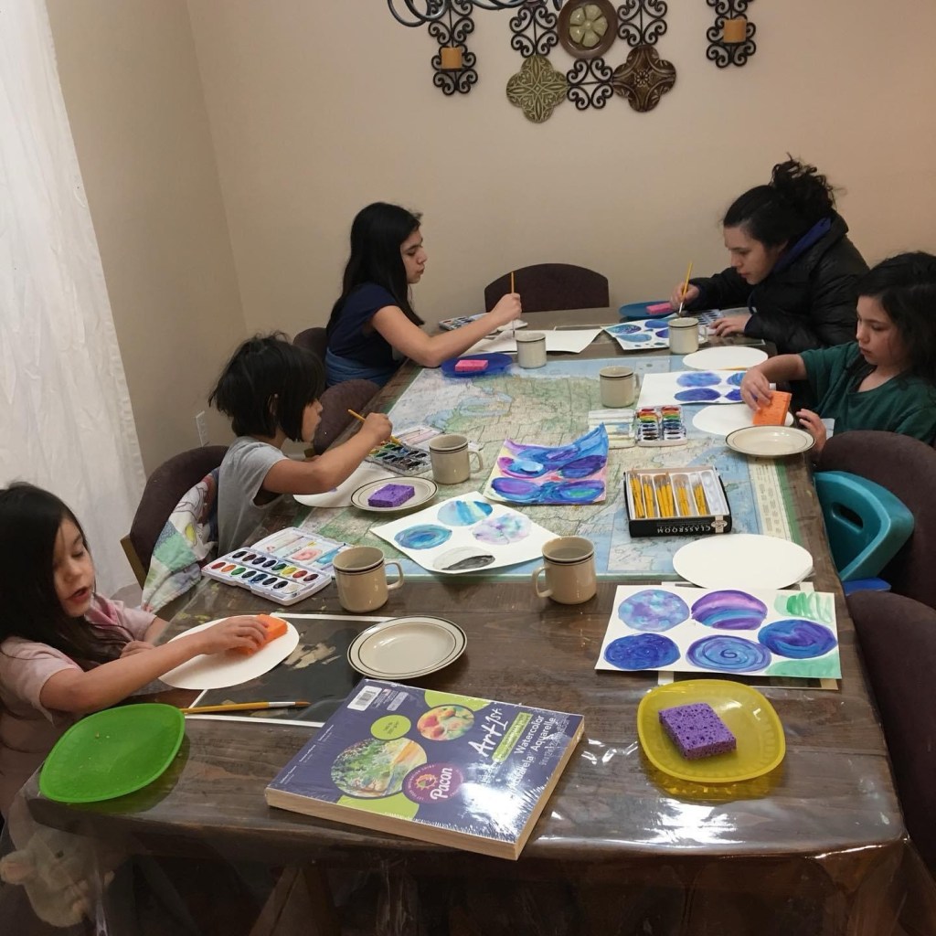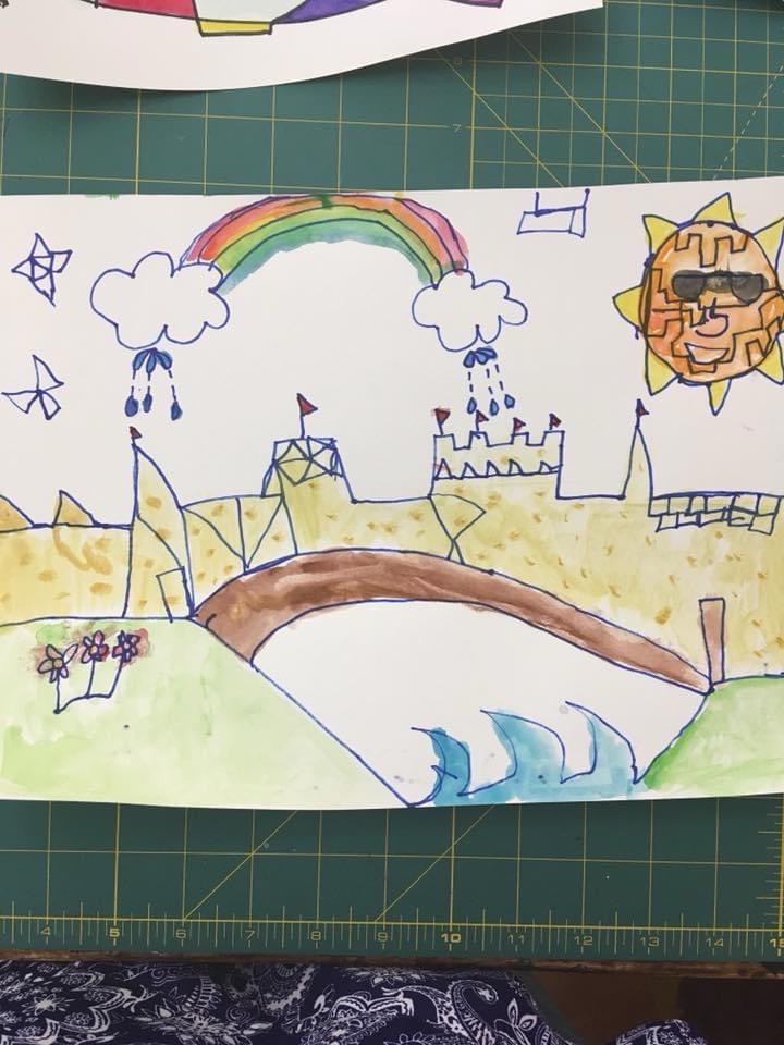
Last week the young women I work with voted to have painting for their weeknight activity. So I pulled out a lesson plan from Deep Space Sparkle Art that I loved when we did it for home school.

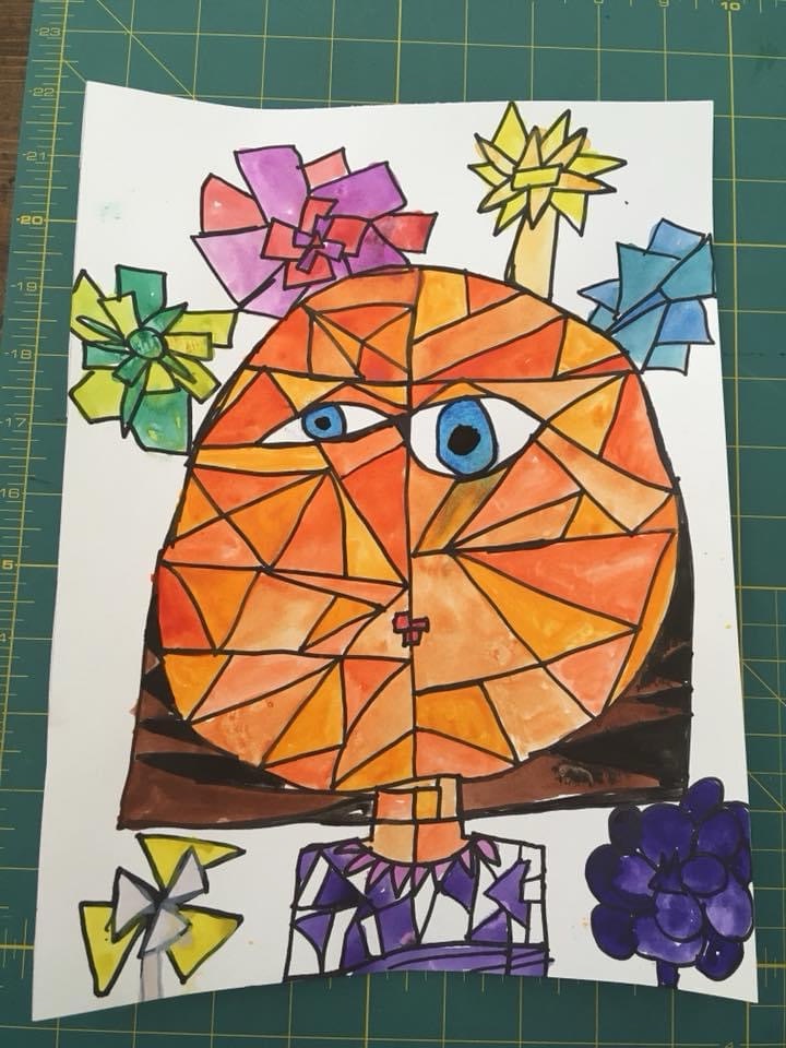
I practiced it at home first, and was really tickled with how it turned out.

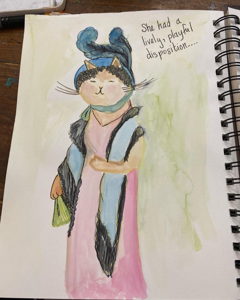
This one I did as a demonstration during the activity. All the girls did their own thing, quite different from the lesson instructions, which is their prerogative.
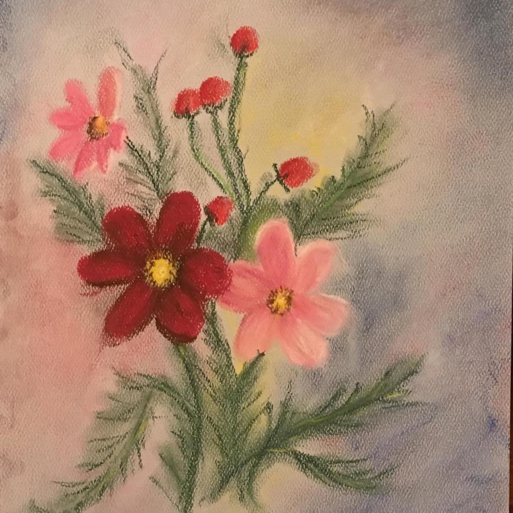
I was so delighted with my two speedy paintings that I wanted to see what I could do taking a little more time, and painting on a canvas instead of 90# sulfite paper.

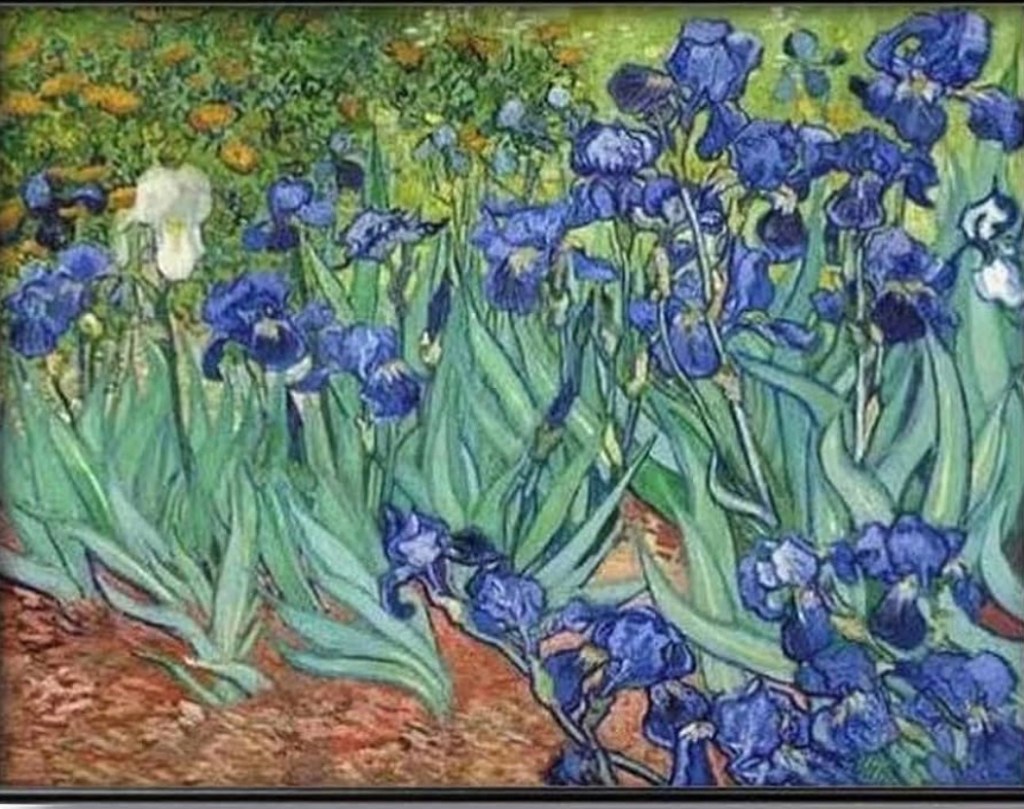
I used pencil instead of sharpie and looked at a lot of pictures of irises, including old photos of the beautiful irises growing at our home in Missouri that my mother-in-law gave me.
I had to leave the project midway to take the kids to a Girl Scouts kick-off activity. I really want my girls to participate in this as it is the only after-school activity (that isn’t a sport) that I know of here.
It was a great activity, the girls painted some flower boxes and then learned from Navajo women how to plant flowers and vegetables here in the desert, layering sand and potting soil. They planted wildflower seeds in the boxes, and we headed home. We live so close to the school that we walked- it’s a little over a half mile. I admit, I regretted walking, as by then we had been outside for over two hours in the heat and the sun.
When we got home, I was so hot and thirsty. I was talking to the kids and looking at my painting, thinking what it needed next.
Absentmindedly, I picked up the mug of water I had been rinsing my paintbrushes in, and took a big drink. I swallowed at least half the mouthful before the tempera flavor of the water registered.
Ugh! Yuck! ☠️☠️
I am pretty sure tempera is non-toxic, but apparently it triggers my heartburn. I’m not dying, but …. Ack…😫
Maybe drinking paint water by accident means I’m a real artist now- like a baptism of sorts…

Anyhow, this is where the painting is now.
I think the biggest problem is a proportion problem. The leaves should all be longer and larger in comparison to the blooms. The blooms are too big.
I think this painting also lacks the energy of the quick paintings I did before- maybe because I went more slowly, or maybe because the leaves are too small (and the leaves supplied a lot of the “movement”), or maybe because I mixed my colors more slowly and lost the orange tones.
Despite that, I think it’s really nice, and I’m proud of it. However, if I’m going to keep following the inspiration, I should fill the top, especially the top left corner, with orange blobby flowers.
Do I add more, because the top is kind of empty, risking that I’ll hate the result, but possibly achieving a more interesting painting?
Or do I let it be and just appreciate it for what it is?
Or does it lack something else?
This is where my lack of training shows, and I need a mentor or a teacher to make suggestions that I’m too inexperienced to realize that I need.
Side note: I enjoy using tempera paint. It is interesting the way top layers blend into base layers. In some ways that is limiting and in some ways it can be really helpful. I like double loading the brush (with 2 colors) and letting the paint mix right on the canvas.
My great grandmother painted with tempera paint, and her paintings are so precise. I don’t know how she painted so precisely with tempera. My best guess is that she had better brushes. I need better brushes for sure.
❤
GlowWorm